He is an award winning Dutch graphic designer who is known for his love of grids. He has designed many posters, as well as several fonts such as New Alphabet, Stedelijk, and the Fodor Alphabet.
Emigre Fonts
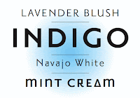
Modula
Designed by Zuzana Licko
This is a mono-weight typeface that looks to be composed of mostly straight pieces, with several rounded elements, and straight serifs. The H is a letter that sticks out to me because the serifs only exist on the outside, and don't fill the space in between strokes on the inner of the H. This is seen on other letters, and emulates a wide stance, which resembles a cowboy standing bow-legged.
Western, strong, bold, skinny, and rectilinear.


Cholla
Designed by Sibylle Hagmann
A modular font with smooth round edges, and strong bold strokes. Seems to be constructed of rounded rectangular pieces, as well as squares. The lower case a in interesting for the way the strokes meet, and the width gets dramatically thinner.
Smooth, digital, thin, square, rounded.


Priori
Designed by Jonathan Barnbrook
This fond is very straight, and a clean sans serif. It looks to be constructed of angular pieces, and square. The uppercase N is one that is interesting, the strokes don't entirely meet, leaving a little space that is left defined. The G also doesn't have a spur, or a serif of any sort, just an upward stroke.
Clean, simple, geometric, rectangular, dynamic.

Fuse Fonts
Typeface Four
A very narrow, condensed typeface, with sharp terminals. Constructed with thin pieces and shallow or severe angles. The S's vary in this photo below, one is very sharp and looks nearly paper-clip like, while the other more close resembles a crow-bar and is much more shallow.
Narrow, thin, sharp, retro, and dynamic.

Pop
A modular typeface that is composed of small circles. Resembles a marquee, or perhaps a pegboard. Constructed of tiny circles laid out in a pattern or grid.
Circular, grid, dots, simple, structured
Moonbase
A very bubble-like spacey font. Constructed of rounded rectangles and rounded edges, resembles an oil spill, and appears liquidy.
Round, smooth, liquid, space, bubble.
No comments:
Post a Comment