THE DIFFERENCE BETWEEN
Font design is a process in which a designer creates an alphabet (including special characters and punctuation and all of the goods) to be used over and over again. Helvetica, Univers, Memphis, these are all fonts that were designed by designers. But lettering is more specific to the assignment, the letters will only ever serve one purpose: to exist in that word in that design. The letters themselves will differ from other letters, purely for an aesthetic choice. These letters can never be used over and over again, for they only have one purpose.
As Jessica Hische put it, "As a letterer, when I’m hired to draw the word 'holiday' I don’t first draw the entire alphabet in the style I wish, then position the letters to spell out the word."
LETTER FOUNTAIN // SUMMARY
Small Capitals, Ligatures, Diphthongs, and Logotypes
Small caps are specially designed capitals. They are smaller than capitals, but larger than the x-height of the lowercase, yet possess the same weight as them. Because they are close to the same size as the lowercase letters, and share the same weight, they are preferred in bodies of text because they are less demanding.
Ligatures are the combo characters that eliminate the unsightly overlap of neighboring letters. Logotypes are combo characters that are less noticeable. Best example of a logotype is an ampersand. It represents the Latin word, "et", which means "and". "&" is a combination of "e" and "t". Diphthongs are letter combinations to help the reader with the pronunciation of the word.
Modular
Modular typefaces were designed to accommodate the printers of those days. These typefaces are incredibly simple and basic in terms of design. Irregular spacing between letters is common due to the nature of the modular method.
The First Capitals
The first capitals can be accredited to Ancient Rome. Using a square base and other geometric shapes to guide them, Romans would then carve the letters into stone. This gives them the classic weight and serif that we all recognize today. But since it was composed of only capitals, relied on a square base system, and several letters weren't introduced to the alphabet yet, it made it nearly impossible to add variation to the typeface.
L'histoire se répète
With advancement of technology, legibility of the text became increasingly important. Helvetica was introduced in the 50s, a highly popular sans serif font. Although it is a popular font, it is was labeled as "cold". Typographers began to focus on the negative space and the balance of the letter space and the page space. Through such focus, Adrian Frutiger created a typeface with more expression for the Charles de Gaulle airport. This font later became known as Frutiger. Frutiger and several other young designers released fonts that harked back to the first capitals of Rome.
The Lowercase Letter
There were no lowercase letters in Roman type, therefor there were no real examples to look to or modify. But with the quill, we start to see the development of lowercase letters. Lowercase letters are typically thinner than capitals. While only slightly thinner than their counterparts, this contrast still gives the emphasis to the capital. This contrast between capital and lowercase letters can be seen in serif fonts, as well as sans serif fonts.
Classification
Each letter can be grouped based on its construction and form. Both capitals and lowercase have their own break down of classification.
What you Measure
Type is designed using a mixture of guides and geometric shapes. Over the centuries, type design has been broken down into an art. The letter shape in contrast to other letters of the typeface, as well as the distance between each letter, has been mathematically figured out. Spacing is important for each letter to have the space it needs to read, but the spaces only have to appear the same. The letters need to be close enough together to be easily read, but not too close. The white space is also just as important as the letter itself. As Fred Smeijers wrote, "Its a balance between black and white." The form of the letter is important for readers, because it shouldn't be distracting from the content. Antique Olive is a typeface that is either hated or loved. It breaks rules, but maintains incredible legibility. In comparison to its competition, its x-height is significantly larger. This make the ascenders and descenders shorter, and compensation in the lack of room leads to the shifting of the crossbar of the "f".
Digital Aesthetics
In the digital age, it has become increasingly easier to create your own "digital language". Creating ones own publication, or form of communication, or alphabet now has no limits. Two movements had their impact on design and type. The first was a classic movement, where refinements can be seen. The other came in the 90s, when people were free-handing type and teaching themselves to design.
Punk and Graffiti
In due time, graffiti began to become a form of communication and self expression. Recognized by designers for its free form and use of color, it became an inspiration to redefining type as we know it. Experimentation began, and typefaces were being mixed up and combined. A total disregard for function became a mindset in several designers. Photocopying, cutting and pasting, and many other ways to make type for expressive became popular methods of experimentation.
The Magazine
More and more artists and designers were able to create magazines. These forms of expression allowed for the experimentation of type, as well as a way to communicate new and radical ideas. As these independent magazines began showing up, designers began to publish and share their new and strange compositions, frankenstein typefaces, and newfound creativity.
Small caps are specially designed capitals. They are smaller than capitals, but larger than the x-height of the lowercase, yet possess the same weight as them. Because they are close to the same size as the lowercase letters, and share the same weight, they are preferred in bodies of text because they are less demanding.
Ligatures are the combo characters that eliminate the unsightly overlap of neighboring letters. Logotypes are combo characters that are less noticeable. Best example of a logotype is an ampersand. It represents the Latin word, "et", which means "and". "&" is a combination of "e" and "t". Diphthongs are letter combinations to help the reader with the pronunciation of the word.
Modular
Modular typefaces were designed to accommodate the printers of those days. These typefaces are incredibly simple and basic in terms of design. Irregular spacing between letters is common due to the nature of the modular method.
The First Capitals
The first capitals can be accredited to Ancient Rome. Using a square base and other geometric shapes to guide them, Romans would then carve the letters into stone. This gives them the classic weight and serif that we all recognize today. But since it was composed of only capitals, relied on a square base system, and several letters weren't introduced to the alphabet yet, it made it nearly impossible to add variation to the typeface.
L'histoire se répète
With advancement of technology, legibility of the text became increasingly important. Helvetica was introduced in the 50s, a highly popular sans serif font. Although it is a popular font, it is was labeled as "cold". Typographers began to focus on the negative space and the balance of the letter space and the page space. Through such focus, Adrian Frutiger created a typeface with more expression for the Charles de Gaulle airport. This font later became known as Frutiger. Frutiger and several other young designers released fonts that harked back to the first capitals of Rome.
The Lowercase Letter
There were no lowercase letters in Roman type, therefor there were no real examples to look to or modify. But with the quill, we start to see the development of lowercase letters. Lowercase letters are typically thinner than capitals. While only slightly thinner than their counterparts, this contrast still gives the emphasis to the capital. This contrast between capital and lowercase letters can be seen in serif fonts, as well as sans serif fonts.
Classification
Each letter can be grouped based on its construction and form. Both capitals and lowercase have their own break down of classification.
What you Measure
Type is designed using a mixture of guides and geometric shapes. Over the centuries, type design has been broken down into an art. The letter shape in contrast to other letters of the typeface, as well as the distance between each letter, has been mathematically figured out. Spacing is important for each letter to have the space it needs to read, but the spaces only have to appear the same. The letters need to be close enough together to be easily read, but not too close. The white space is also just as important as the letter itself. As Fred Smeijers wrote, "Its a balance between black and white." The form of the letter is important for readers, because it shouldn't be distracting from the content. Antique Olive is a typeface that is either hated or loved. It breaks rules, but maintains incredible legibility. In comparison to its competition, its x-height is significantly larger. This make the ascenders and descenders shorter, and compensation in the lack of room leads to the shifting of the crossbar of the "f".
Digital Aesthetics
In the digital age, it has become increasingly easier to create your own "digital language". Creating ones own publication, or form of communication, or alphabet now has no limits. Two movements had their impact on design and type. The first was a classic movement, where refinements can be seen. The other came in the 90s, when people were free-handing type and teaching themselves to design.
Punk and Graffiti
In due time, graffiti began to become a form of communication and self expression. Recognized by designers for its free form and use of color, it became an inspiration to redefining type as we know it. Experimentation began, and typefaces were being mixed up and combined. A total disregard for function became a mindset in several designers. Photocopying, cutting and pasting, and many other ways to make type for expressive became popular methods of experimentation.
The Magazine
More and more artists and designers were able to create magazines. These forms of expression allowed for the experimentation of type, as well as a way to communicate new and radical ideas. As these independent magazines began showing up, designers began to publish and share their new and strange compositions, frankenstein typefaces, and newfound creativity.
5 DEAD DESIGNERS
Massimo Vignelli
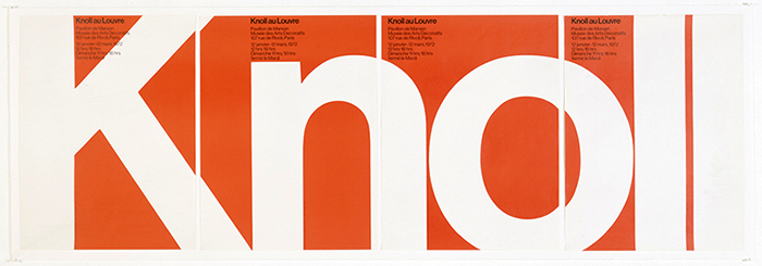
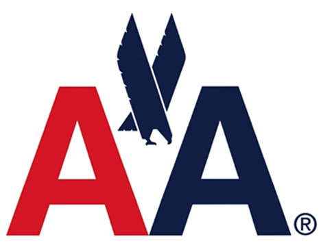
Vignelli was born in Milan, Italy in 1931. He grew up and eventually studied architecture and design in an academy in his home town. In his career he traveled between New York and Milan, working for his own design studio as well as Unimark. He designed brands, packaging, wayfinding, and many other forms of designs. He is recognized for his use of Helvetica, simple and clean designs, and his ability to design anything. Vignelli is responsible for the American Airlines logo, New York Subway wayfinding, Knoll logo, and Bloomingdales logo.
Herb Lubalin
Lubalin is a graphic designer born in American in 1918. Through out his career he proved time and time again that type could have character. His use of type to bring his work to life is seen in his logo for Mother & Child or Families. He worked for many companies such as Eros Magazine, Avant Garde Magazine, the Post Office, the list goes on. He has been a designer and a teacher, leaving in his memory an impressive portfolio.
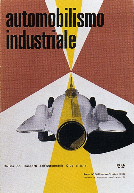
Max Huber
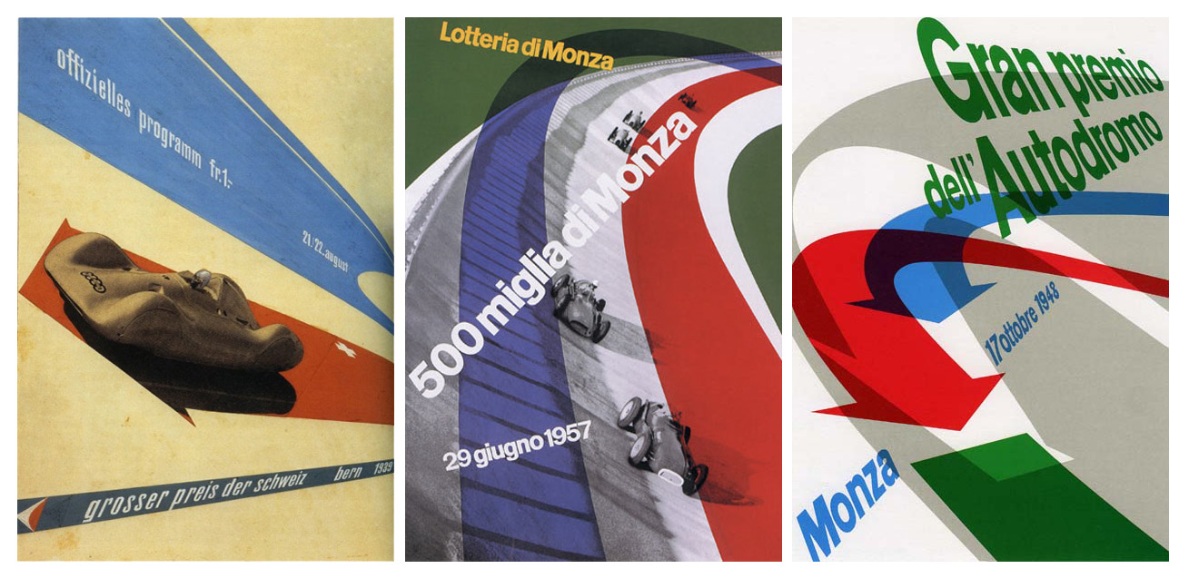
A Swiss born designer, Huber's design grew up with Avant Garde. He studied in Switzerland and moved to Milan to escape the war. When the war spread, he returned back to Switzerland. In both countries he was able to create immensely colorful, future like design. His portfolio expands over all types of graphic design, and some of his most famous work were his posters. He captured movement through type, photography, color, and graphics.
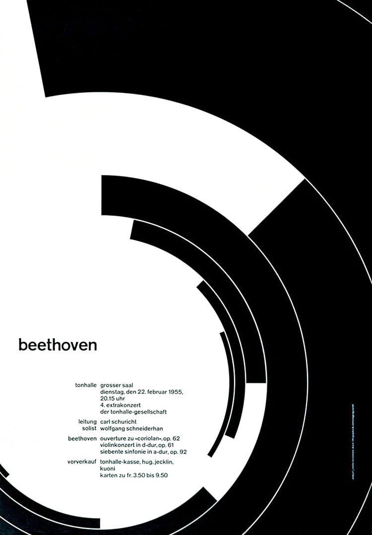
Josef Muller-Brockmann
Easily recognizable among designers from his era, Brockmann truly did have a unique style. His simplicity and attention to communication paired with the grid helped push his posters further. Josef Muller-Brockmann was born in Switzerland, and studied there as well. He and several other designers were responsible for creating the grid, which revolutionized design. It provided a tool that allowed designers to better create balanced and cohesive designs.
F. H. K. Henrion
Born in Germany, Henrion became one of the best known U.K. Graphic Designers. He defined professional graphic design, and produced a large portfolio of work during his career. He is known for "founding the corporate identity", and is recognized as one of the most influential designers in the world. During WWII he was responsible for several posters relating to awareness and advertisements. His designs had longevity, which is proof of his success as a designer.
Sources
Massimo Vignelli
·
Josef Muller Brockmann
·
Max Huber
·
Herb Lubalin
·
http://www.aiga.org/uploadedImages/AIGA/Content/Inspiration/aiga_medalist/MD_LubalinH_Logos_640.jpg
·
F.H.K. Henrion
ADRIAN FRUTIGER
Adrian Frutiger is a Swiss born typeface designer who
developed two popular fonts: Univers and Frutiger. During his time as a
typeface designer, he worked to digitalize typefaces and to move away from the
traditional type settings. As he developed his font, he became involved with
the transition from traditional to phototypesetting’s and began to create a
type family.
Like Jan Tschichold, Adrian Frutiger started pursuing his
career rather young. Even though he had a love for sculpture, he was encouraged
into print by his father and his teachers. At the age of 16, he was working as
a compositor with a printer. Following this position, he went to school to
further his education of type. He returned to school after working again as a
compositor, and studied typefaces.
Through out his career in type, Frutiger produced several
typefaces still put into practice today. He designed the wayfinding signage for
the Paris Metro as well as for the Charles de Gaulle airport, in which he
designed a new typeface. As type changed, metal, phototypesetting, and digital
typesetting, Frutiger followed. He produced type for the new technology, as
well as reimagined his former typefaces to work on a screen.
Univers, arguably Frutigers most successful font, paved the way
for type families. Univers has unifying qualities that tie together each
fashion of the typeface, whether italic, bold, thick, or thin. The consistency of
the type family was revolutionary, and stood out in print among others. The
Univers type family is broken down and organized with numbers to show weight
and width. The unifying elements, and consistency between forms, made Univers
unique.
The Univers grid is a table made by Frutiger to display all
of the faces of the type family. It neatly organizes and demonstrates the
relation, and difference, of each numbered face. The grid creates a gradient of
type, starting with bold and ending with the narrowest and thinnest font.
JAN TSCHICHOLD

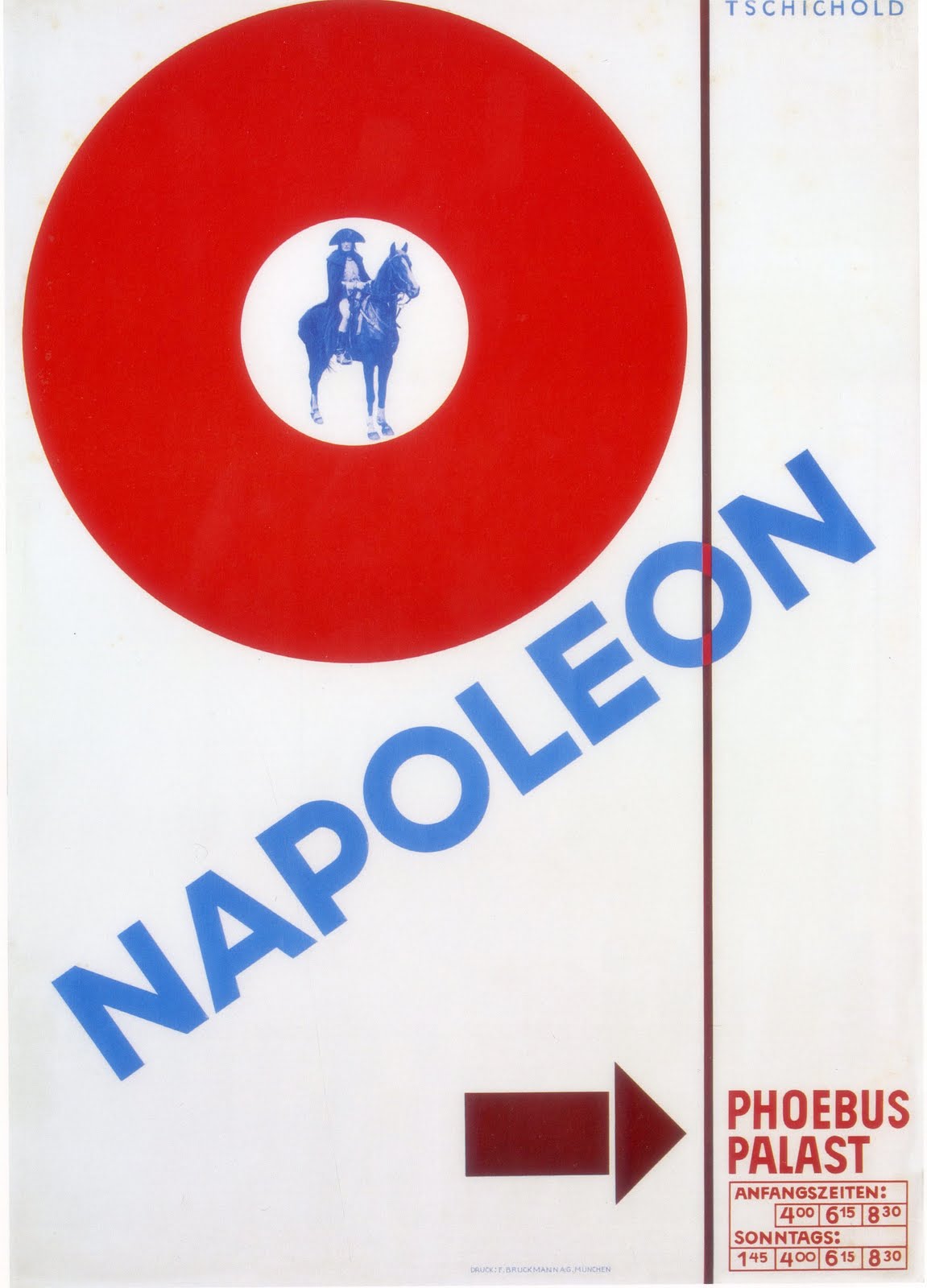
Jan Tschichold is a German born graphic artist best known for his impact on the world of typography. Born and raised by a sign maker, he learned early on how to hand paint script and letters. As he grew older, his passion for art grew and he taught illustration at the age of 14. A few years later he left teaching to pursue calligraphy and typography. Over his life his style developed from traditional serif fonts and calligraphy to astounding sans serif fonts.
In his early career he learned how to do traditional calligraphy and script. He pursued this into college where he was given little restraints and eventually began teaching script classes. This early dive into typography fueled his career and his passion for the rest of his life. After he left the university, he was exposed to sans serif fonts. Originally being infatuated with serif fonts and old scripts, this exposure inspired his style for the rest of his life.
After moving on to sans serif fonts, he played with using them to create impactful graphics. Tschichold redesigned the Penguin book covers and over all design, as well pursued many other impressive accomplishments. His very successful and anticipated books on typography reflect his everlasting impression on the graphic design world. Designers constantly refer to his expertise on typography, and look to his wisdom to improve their own. Even though he no longer exists in the natural world, he lives on through his work, inspiring many designers and type enthusiasts around the world.
Subscribe to:
Posts (Atom)